The problem
Outcomes, Inc. does amazing work for disabled adults and children, so why should their website be anything less than amazing? When I first explored the site, I saw more than just outdated design, I saw missed opportunities. Families searching for support, individuals looking for resources, and donors wanting to help were met with frustrating navigation and unclear paths forward.
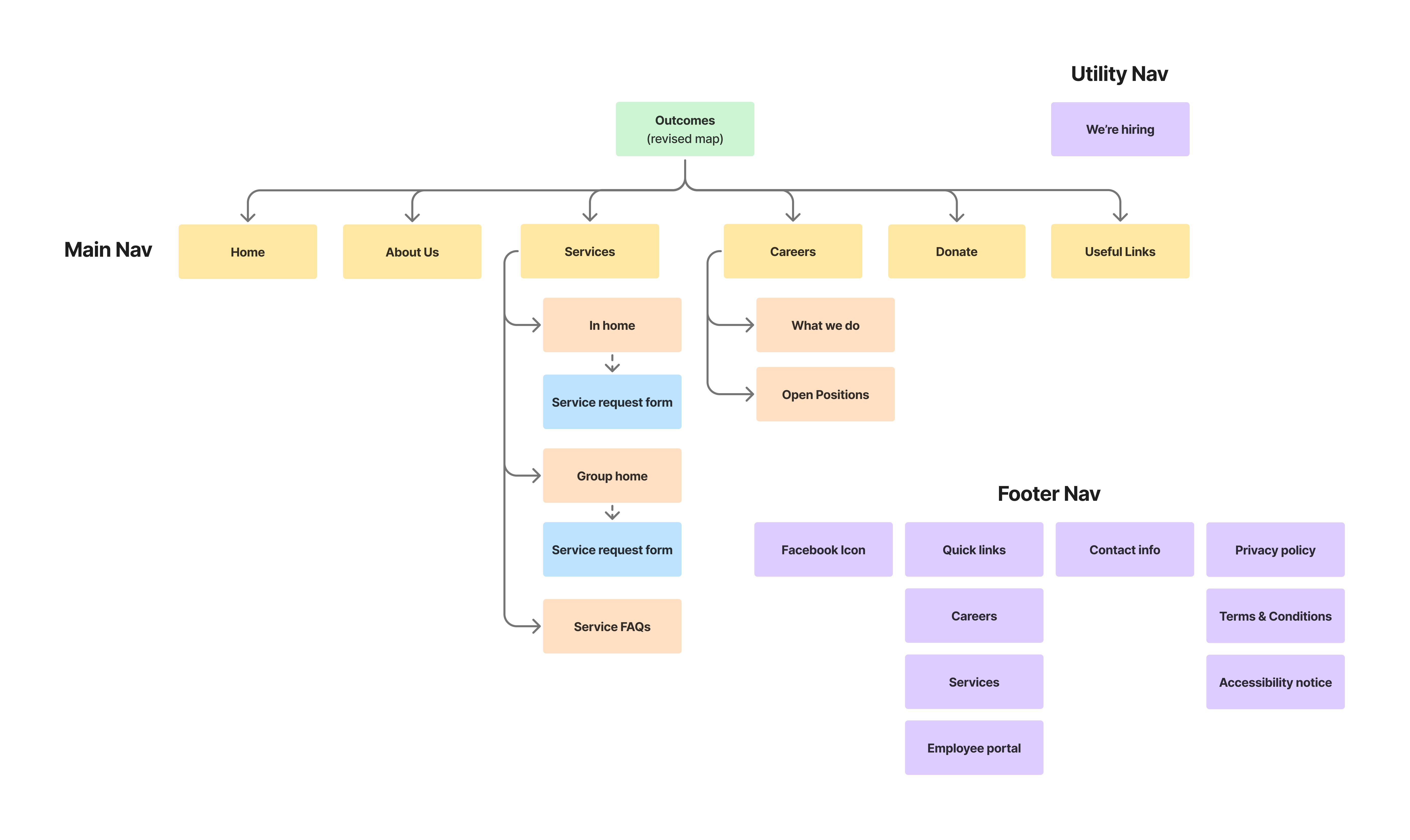
The current site is not attracting new employees. A disjointed sitemap and lack of pertinent information are resulting in high bounce rates and preventing the organization from growing and serving the community.
The Solution
Through in-depth research and analysis, I uncovered key pain points and reimagined the site’s structure to align with the nonprofit’s mission. Now, I’m bringing it to life with wireframes that boost usability and accessibility while maintaining an approachable design that will grow with them.
Immediate actions are to fix broken links and ensure usability on all breakpoints. Long term goal to redesign the site with an emphasis on calls to action to increase engagement in key areas. Prioritize informational content segmented into clear sections for both prospective clients and employee. Integrate hiring process into the main site to create a seamless experience.